The Project
Client: Gilead Dynamics
Deliverables: creative direction / branding / brand strategy
This Mt. Gilead, OH company is on the cutting edge of recycling technology. They created the CBX Carbon Black Extractor: a radical solution to the billions of tires in landfills around the world. It uses microwave radiation to break down tires into valuable raw materials like carbon black, oil, and gas. Their goal is to change the blueprint for the recycling industry by doing something no one has before: make it profitable. They needed branding that inspires trust, highlights innovation, and appeals to high-value investors and buyers.
The Impact
This rebrand wasn't just a refresh, but a complete overhaul of visual and marketing strategy. This identity captures its core values of innovation, integrity, and profitability and channels these into a design system that prospective investors & buyers won't forget.
This project delivered a cohesive identity and robust assets, along with a path to scale as the company does. All while positioning Gilead Dynamics as trusted pioneers in recycling technology.


The Process
From the Tire Hog to CBX
The first step in the design and marketing process was to address the name of the product. Gilead Dynamics' founder, Chris, had been calling his invention the Tire Hog. But once the magnitude of worldwide interest in this technology became clear, so did the need for a more strategic and universally appealing name. Taking note of Gilead Dynamics' values of profitablity and idealism, I steered towards a name that highlights the most profitable material that this machine extracts and landed on the Carbon Black Extractor, CBX for short.
Inspiration
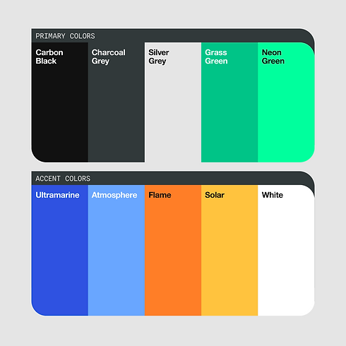
I drew inspiration from shapes, colors, and typography that feel elemental, scientific, and curious. Rounded shapes and shades of green allude to environmental consciousness and regeneration while microwave motifs point to the science behind the machine.


Gilead Dynamics Logo
When designing logo concepts, there were a lot of iterations that leaned into microwave motifs because it helps to illustrate what Gilead Dynamics does and the type of technology they work with. However, many of these fell flat and felt like something was missing.
It felt like I was too caught up with trying to create a logo that explains what the company did versus a logo that represents who the company is. It was all "how" and no "why."
When I landed on this design, it felt like it all finally clicked together. The circulation, the movement, and the overlay all worked together to feel energetic and innovative. All while still incorporating the waves without feeling forced or overpowering.
CBX Product Logo
It was essential to create a strong sub-brand for the product in order to differentiate this specific technology from the overall company. That being said, it was also important for the brands to feel closely related, like a parent-child branding relationship.
Using elements of the Gilead Dynamics logo, I incorporated two of the semicircles where, when flipped vertically, create an "X" shape with the cutouts of the wave.
And by emphasizing the "X," a.k.a. the "Extractor" part of the name, this sets up a branding system for future Gilead Dynamics products in other recycling industries and fit seamlessly into the brand ecosystem.
